Zinnia –
Rebrand Concepts
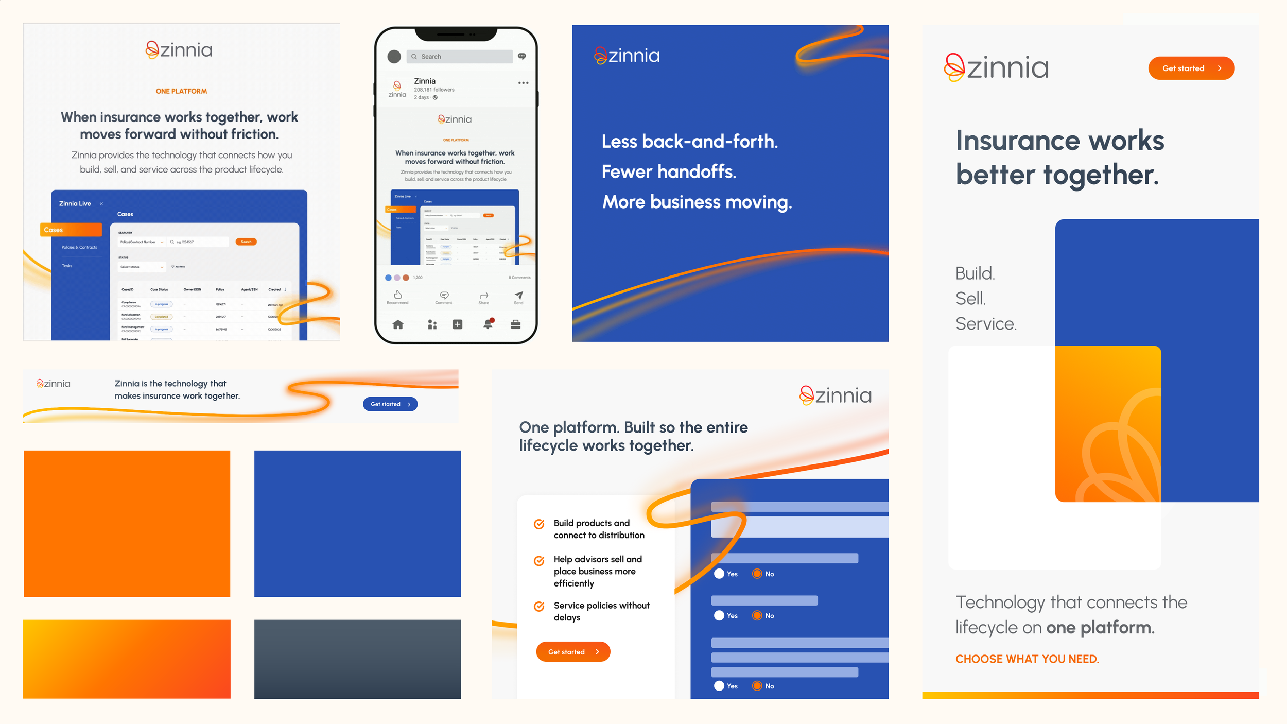
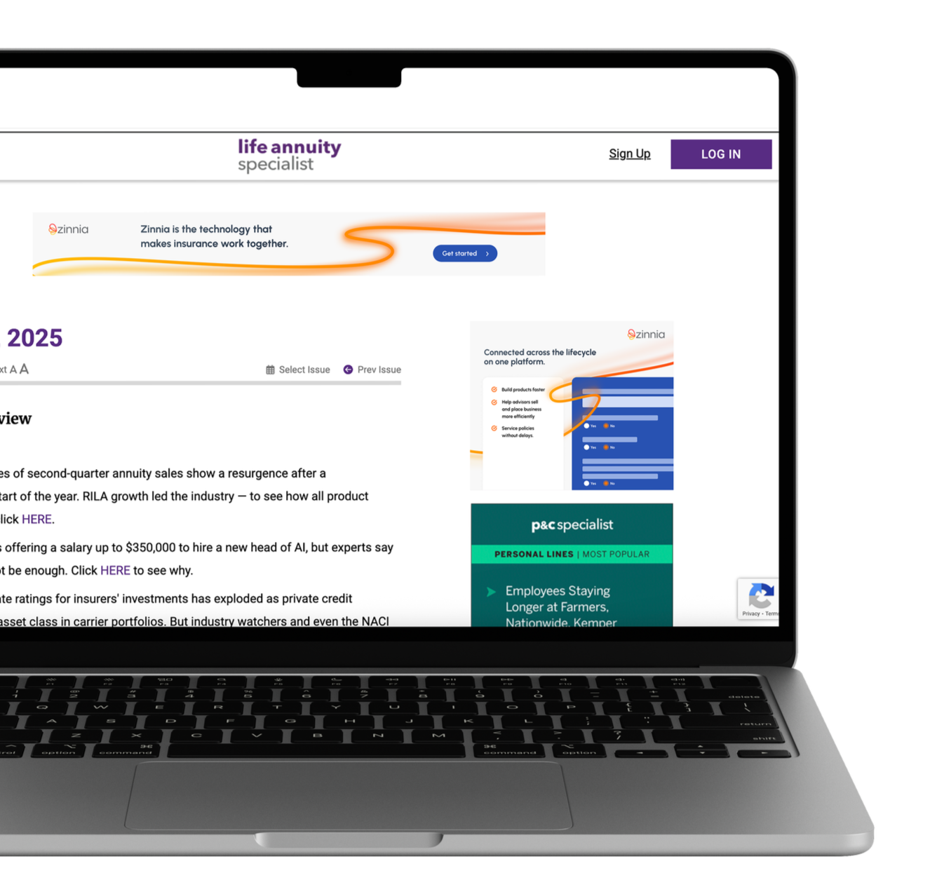
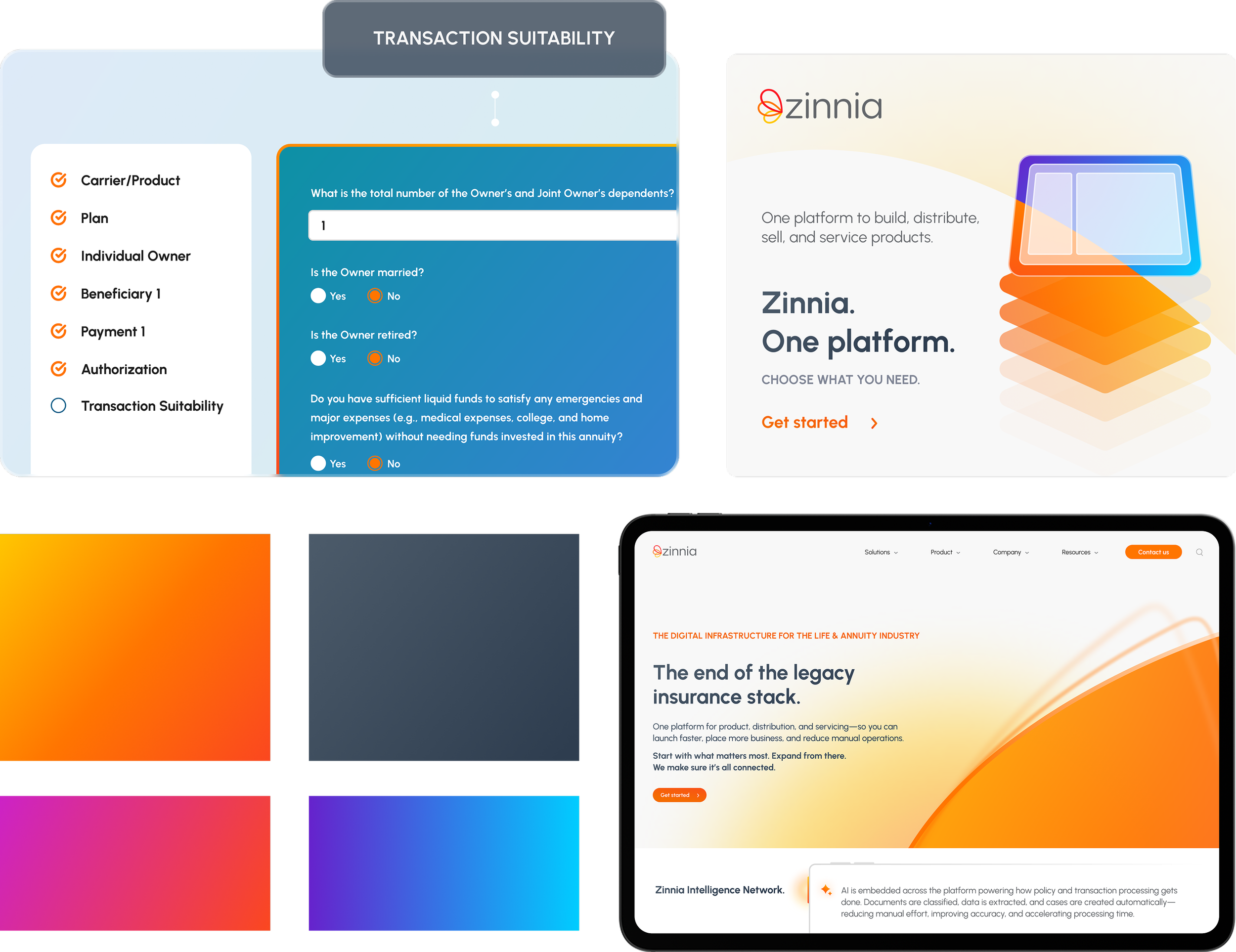
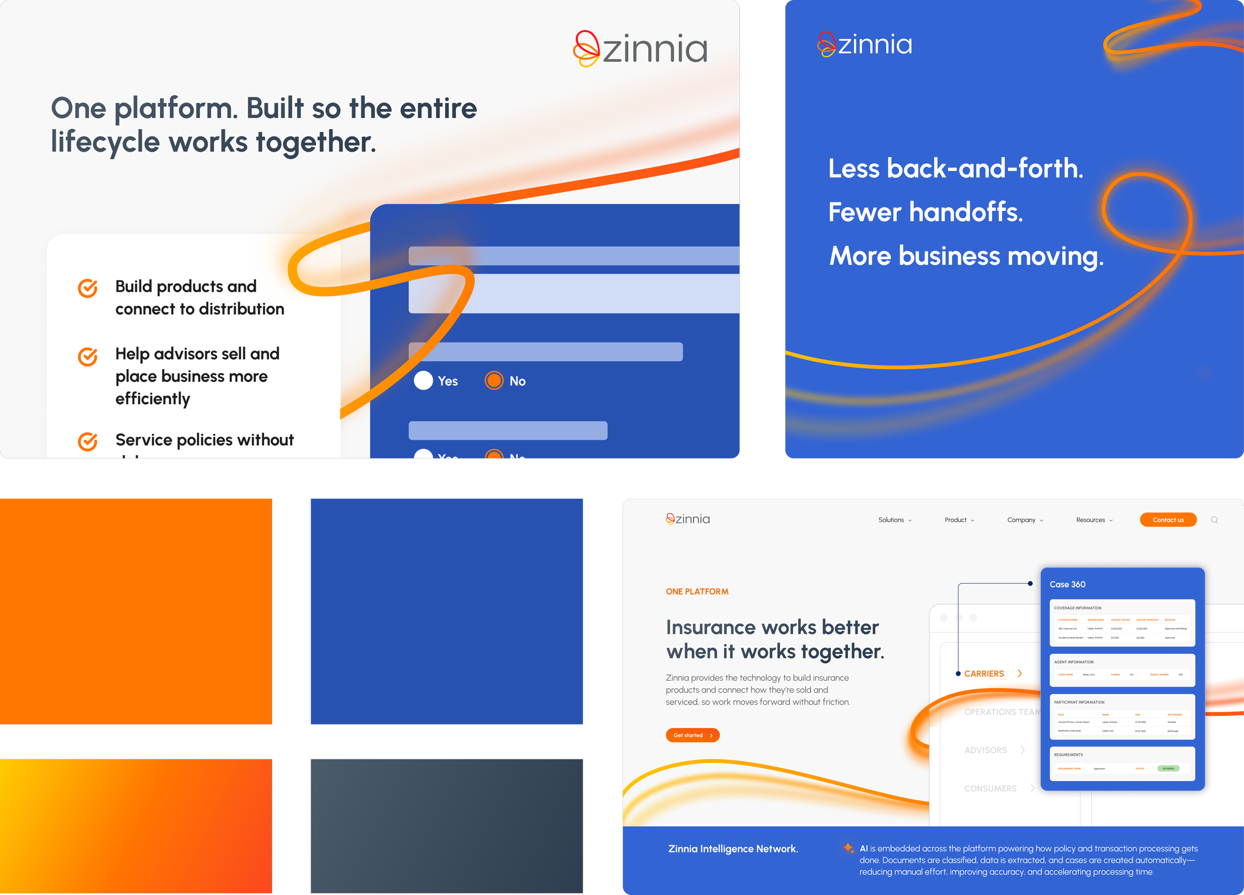
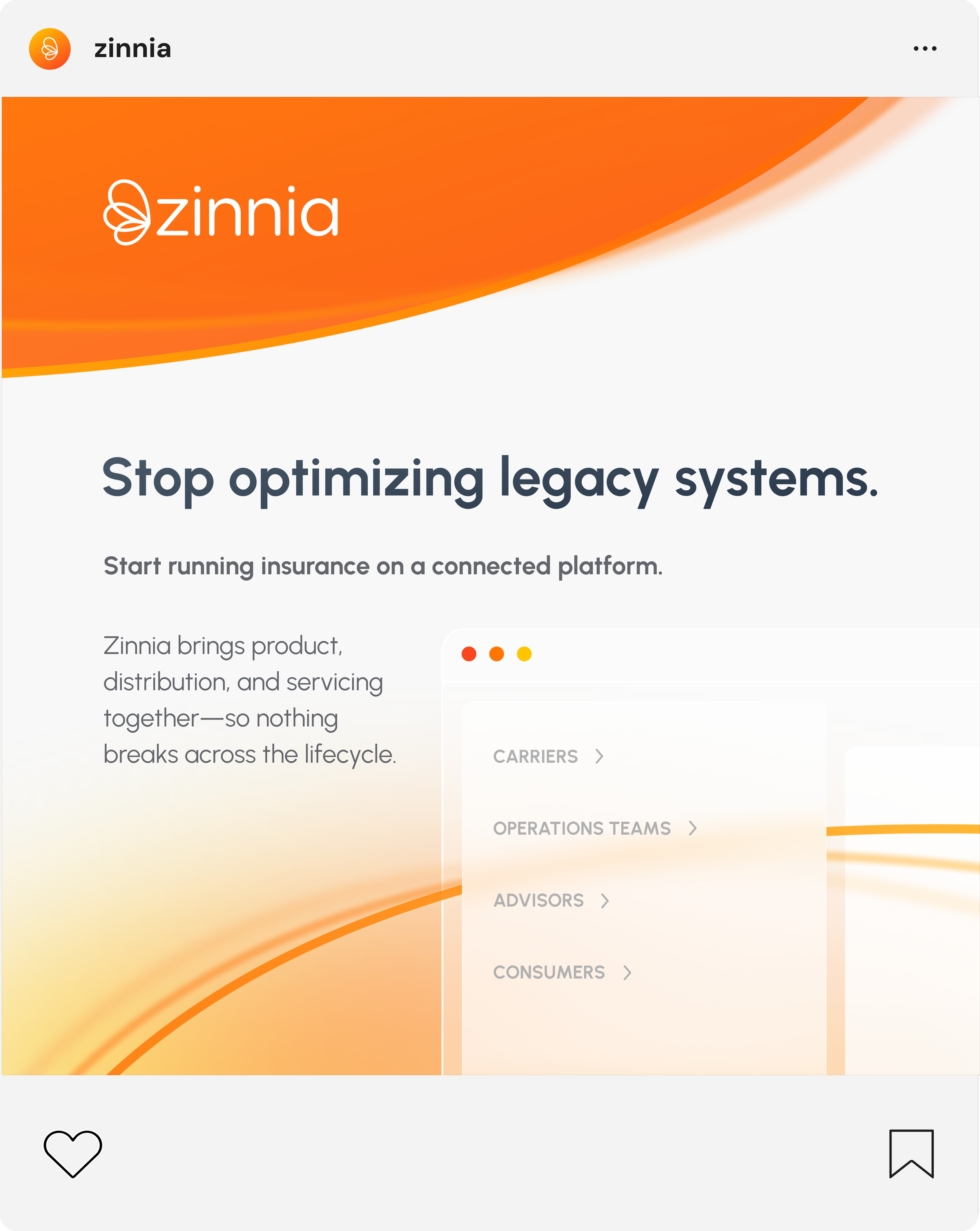
During my time at Zinnia, I explored what a visual refresh could look like — a conceptual exercise in evolving the brand’s design without a full rebrand. Rooted in existing brand foundations, the concept introduces new graphics and an expanded color palette to reflect how the brand could grow alongside the high–tech world.
Skills: Branding, Storytelling
Disruptive
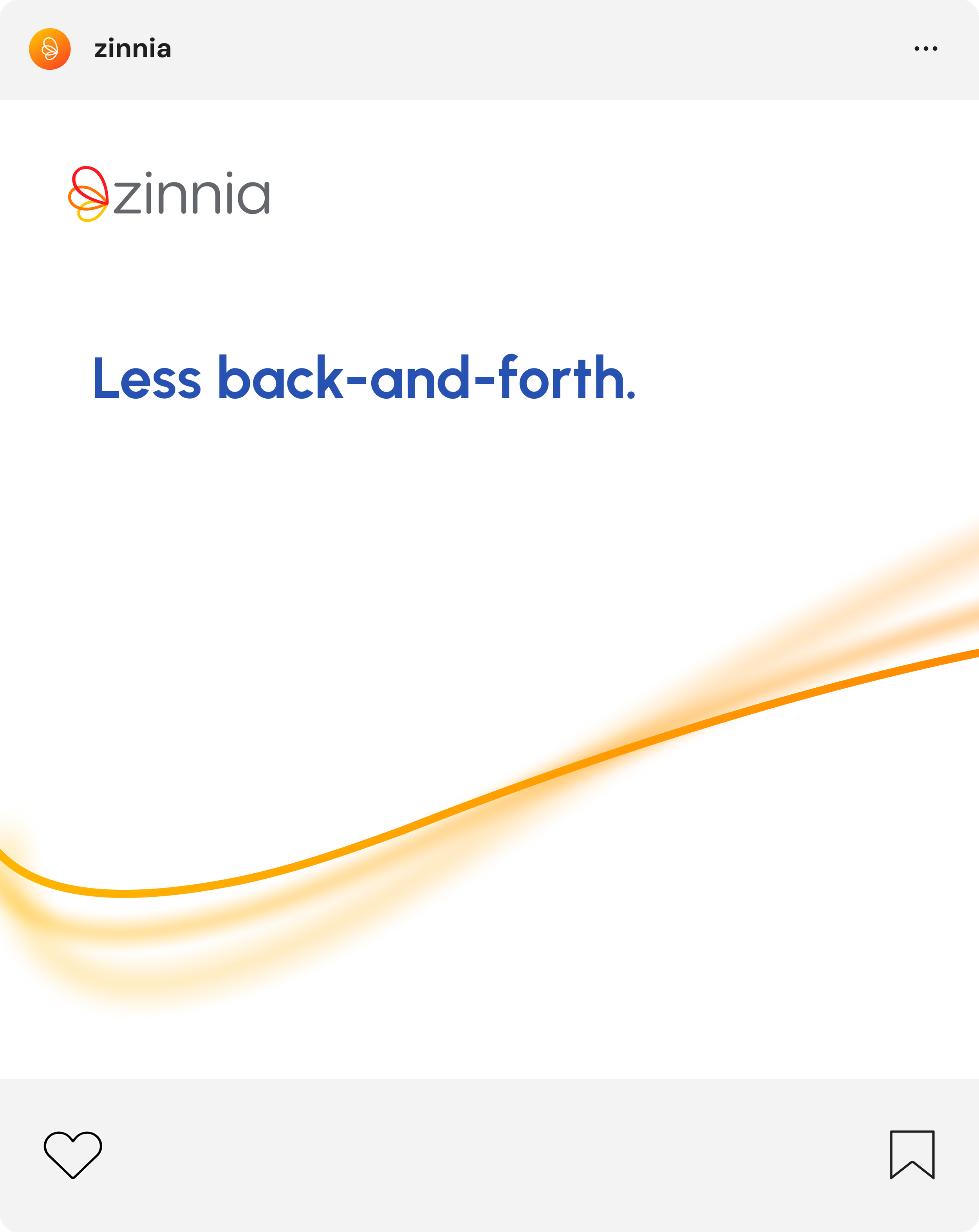
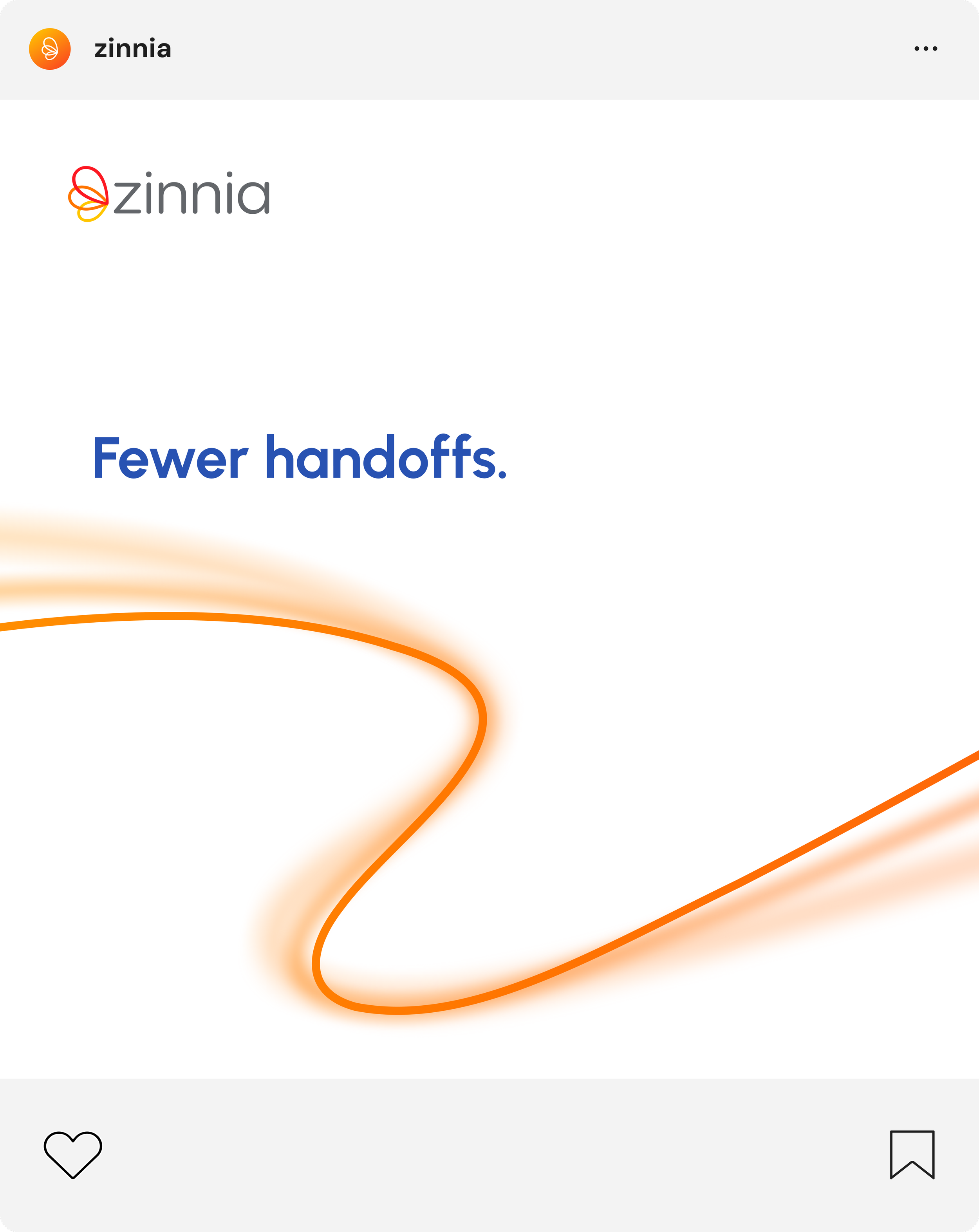
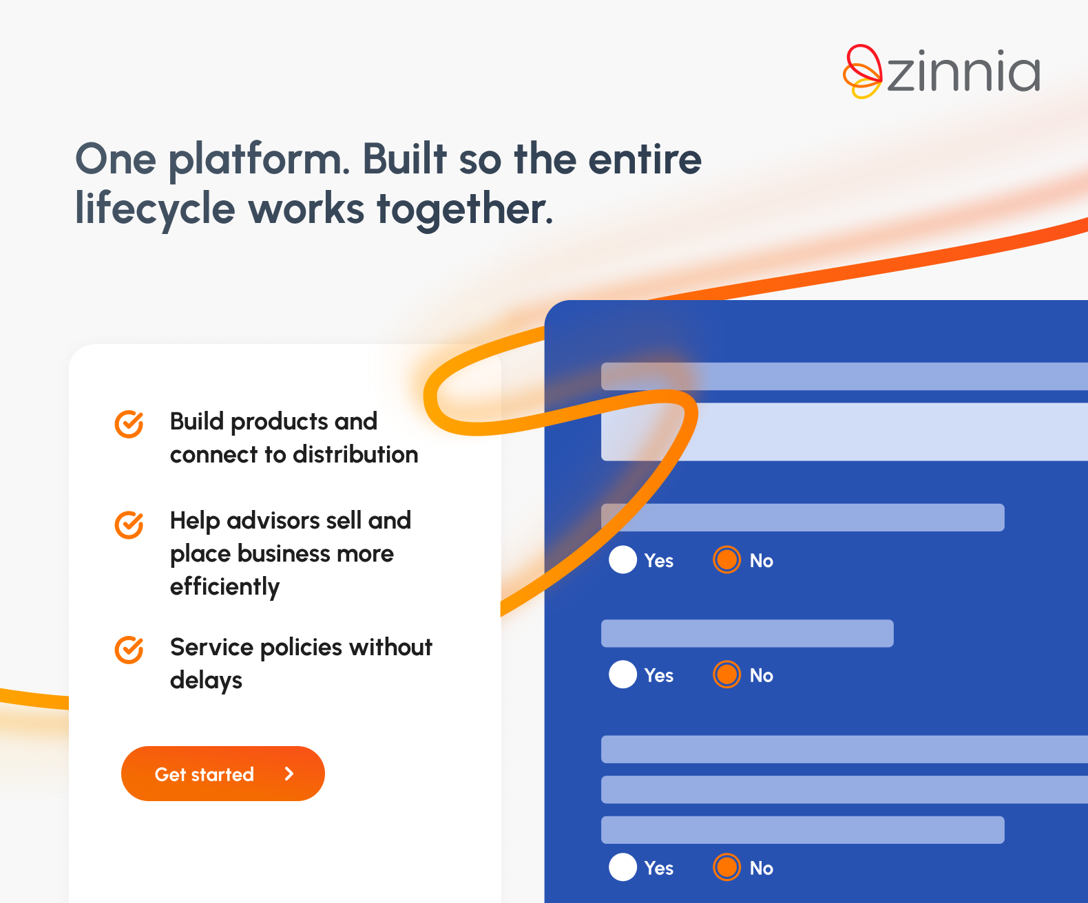
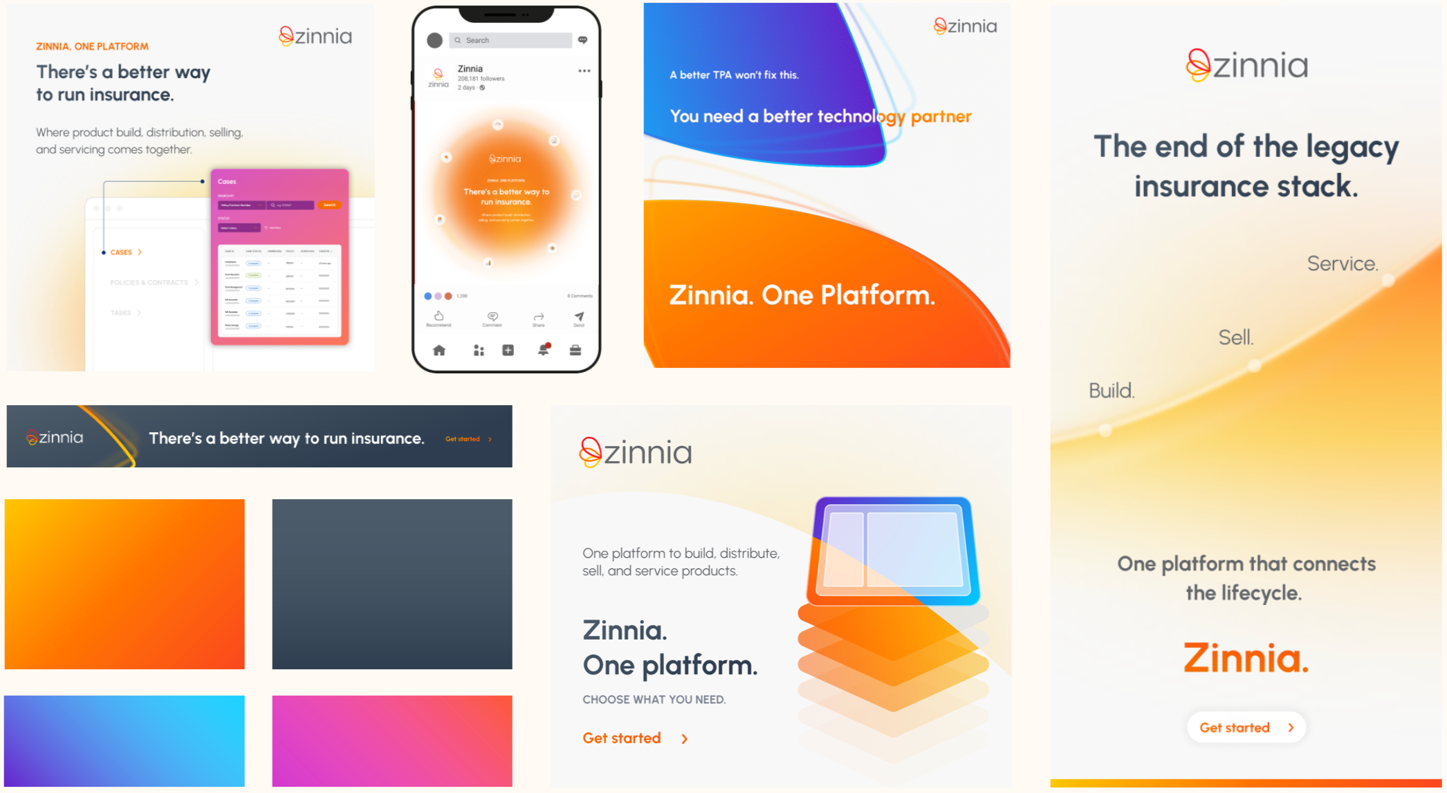
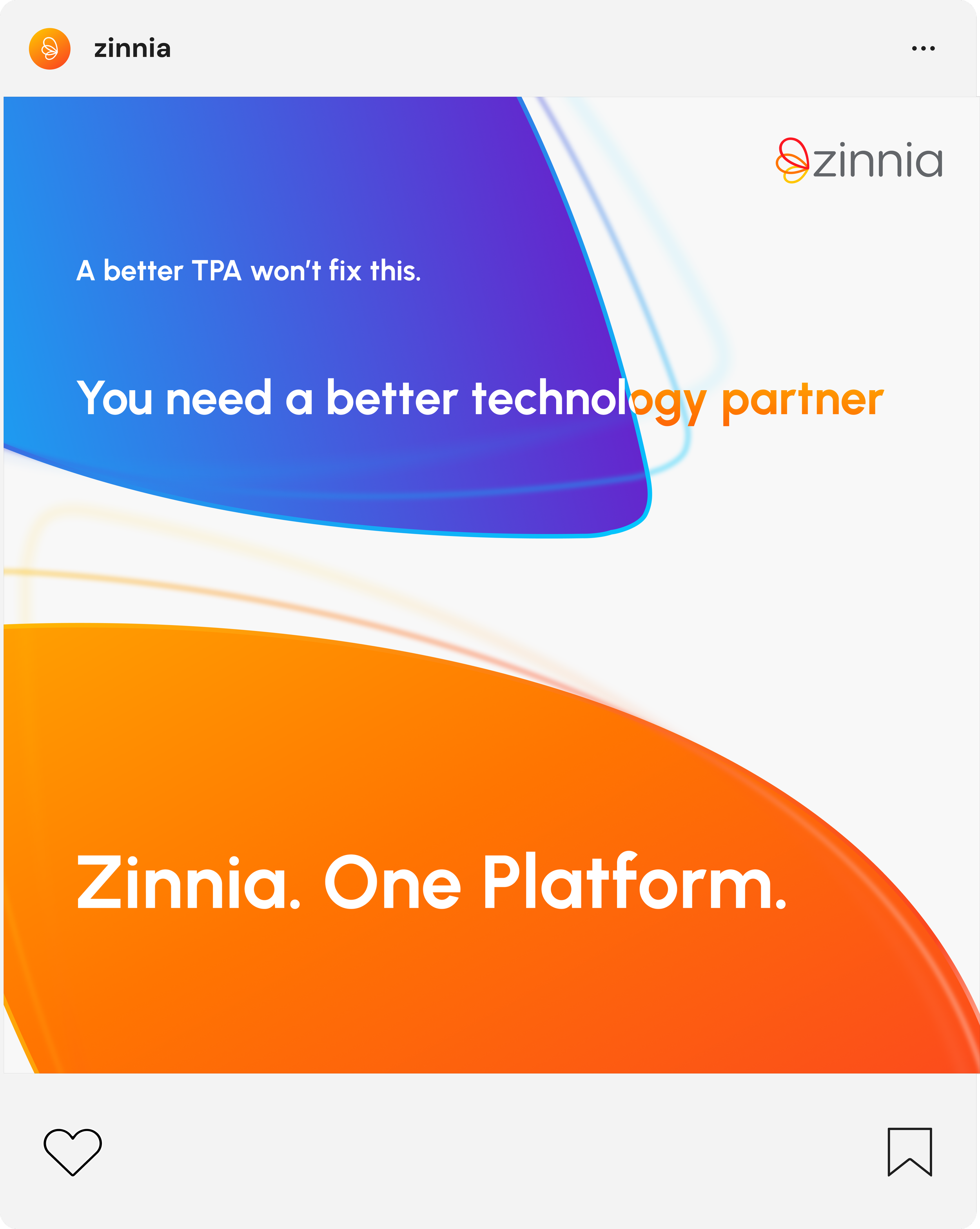
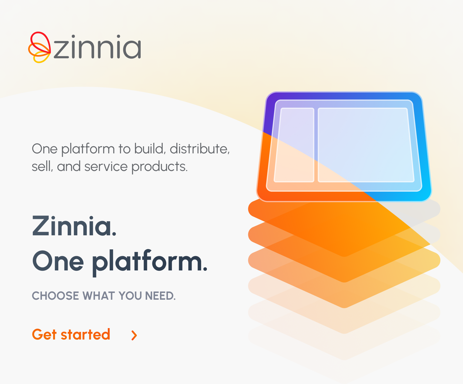
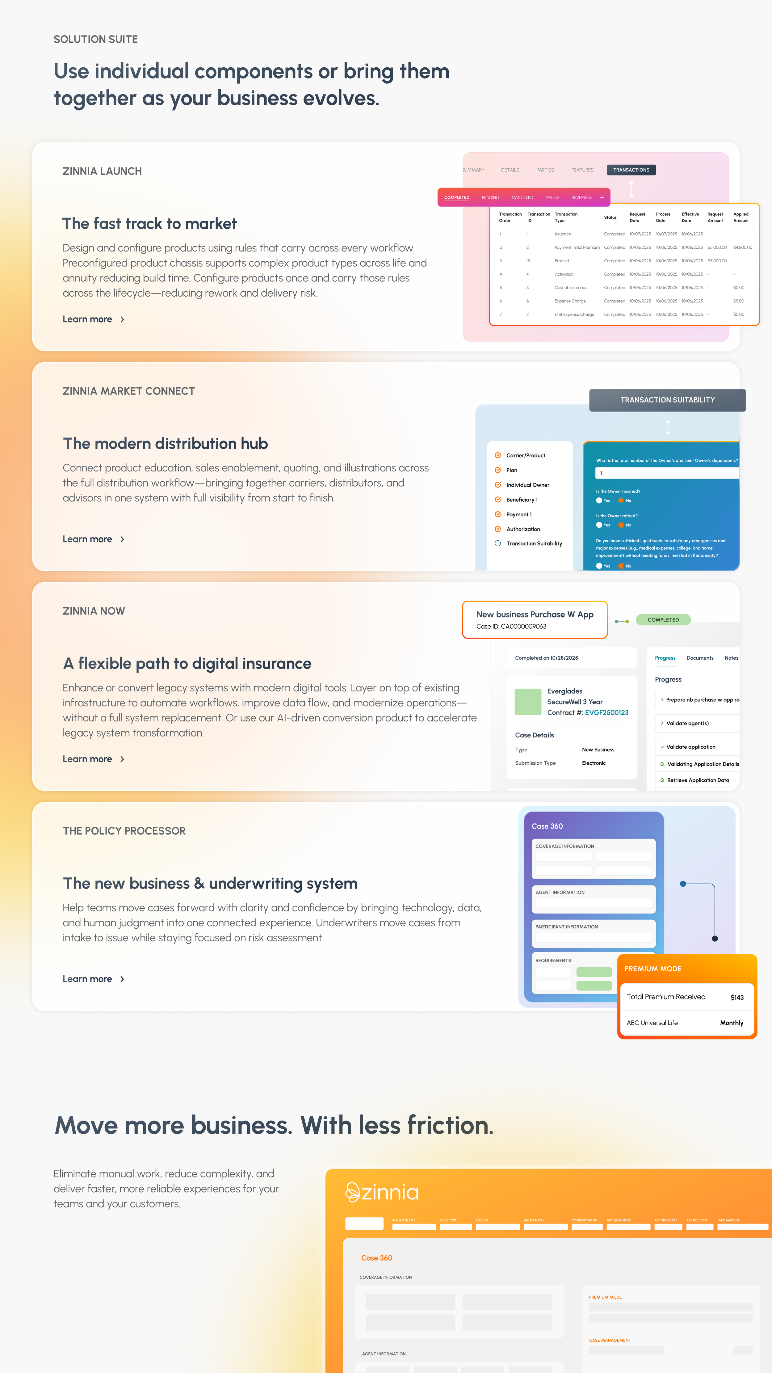
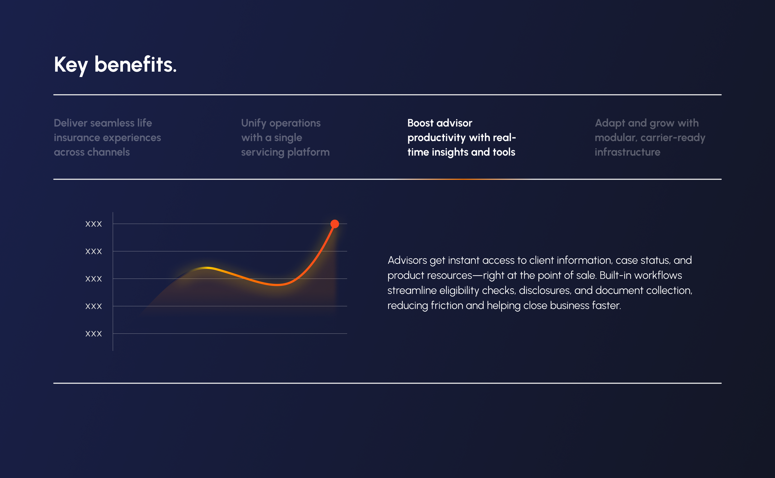
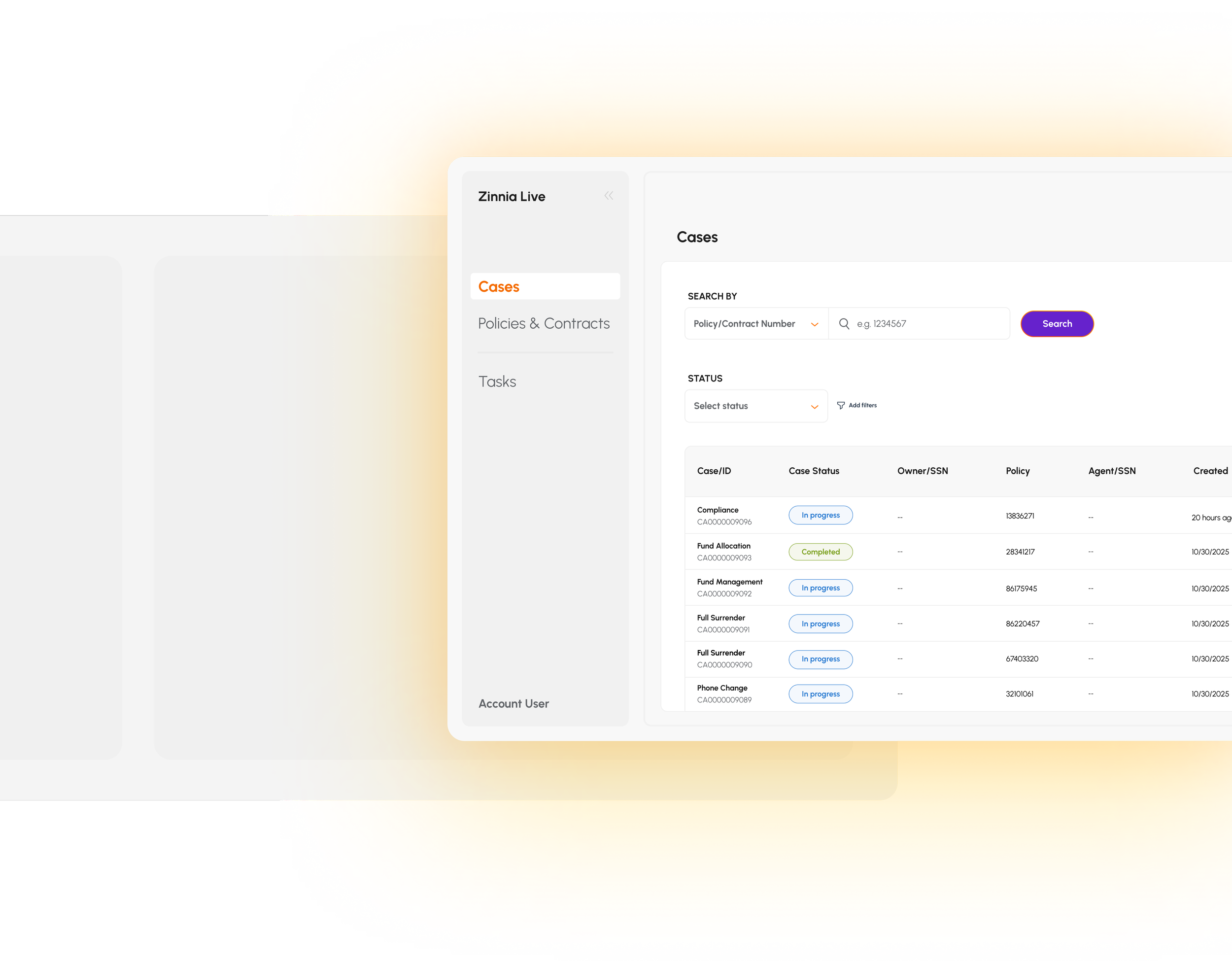
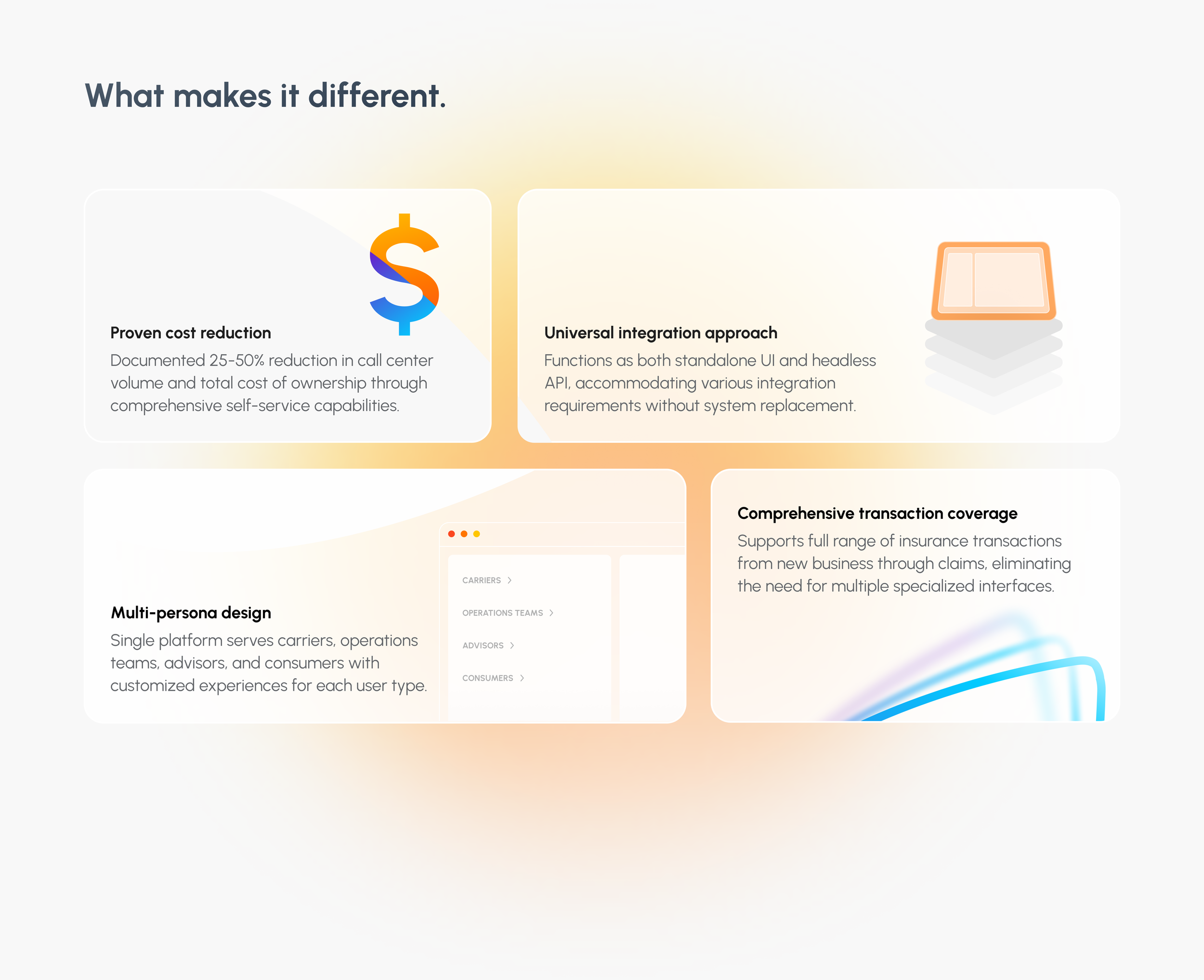
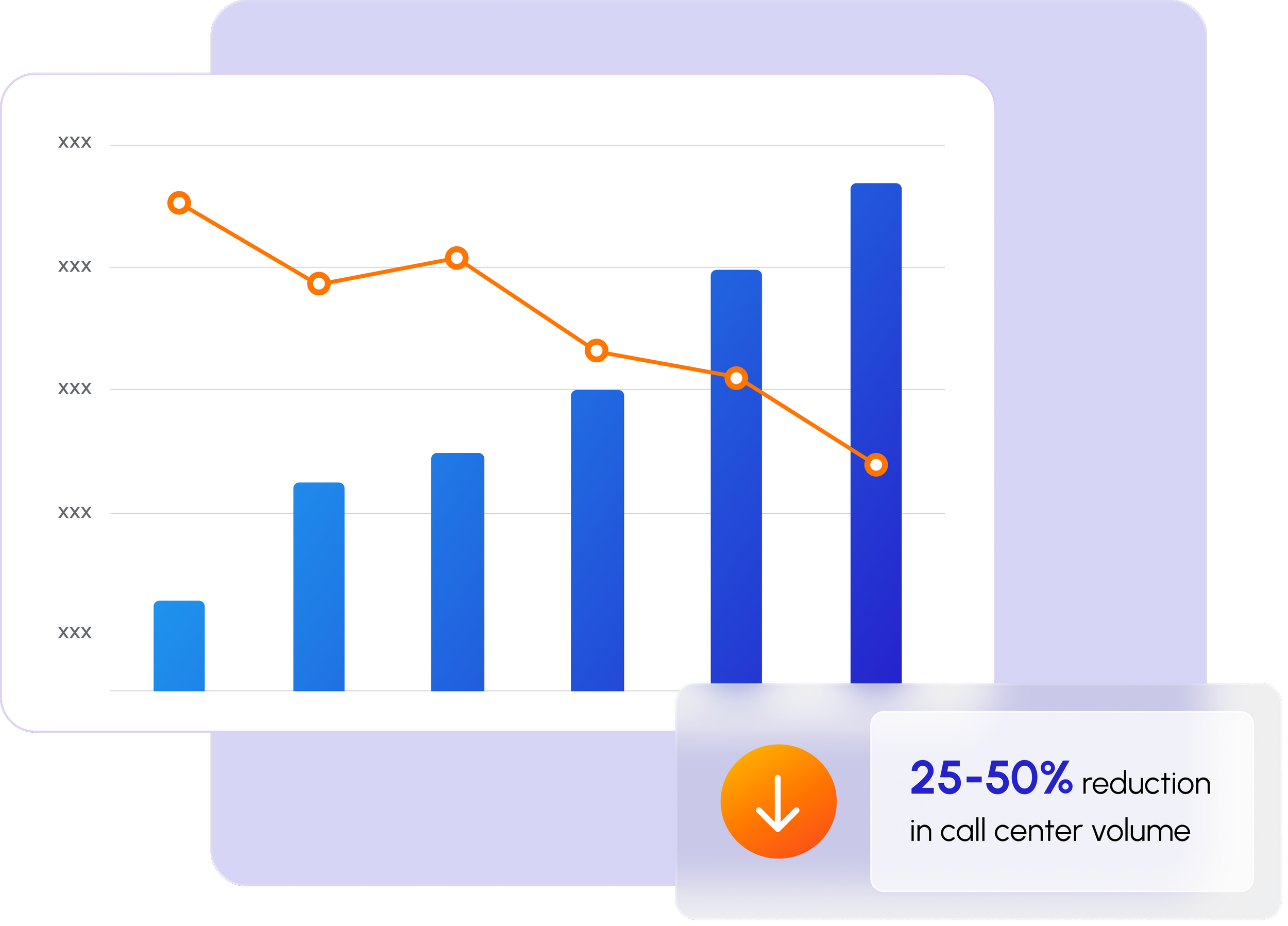
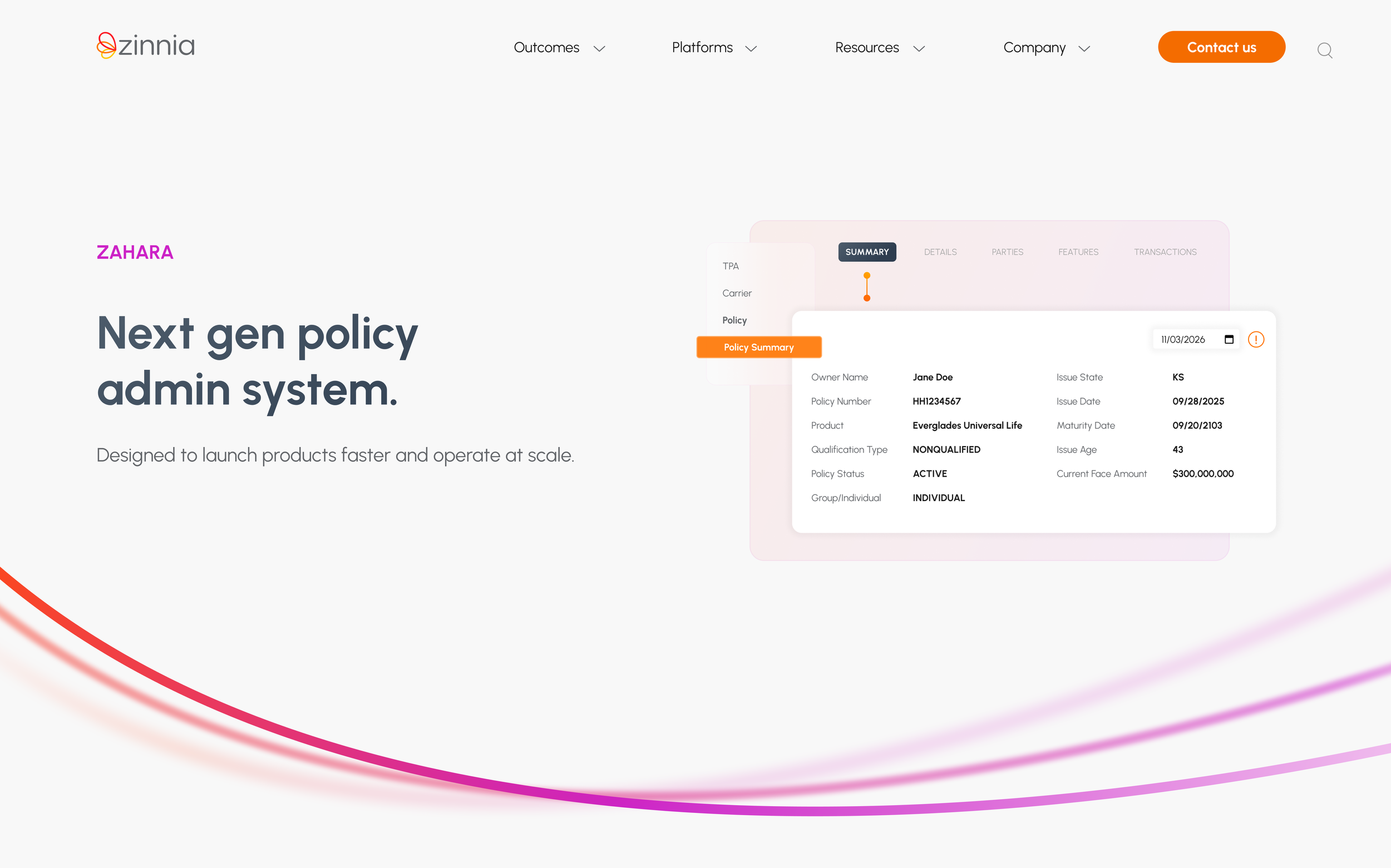
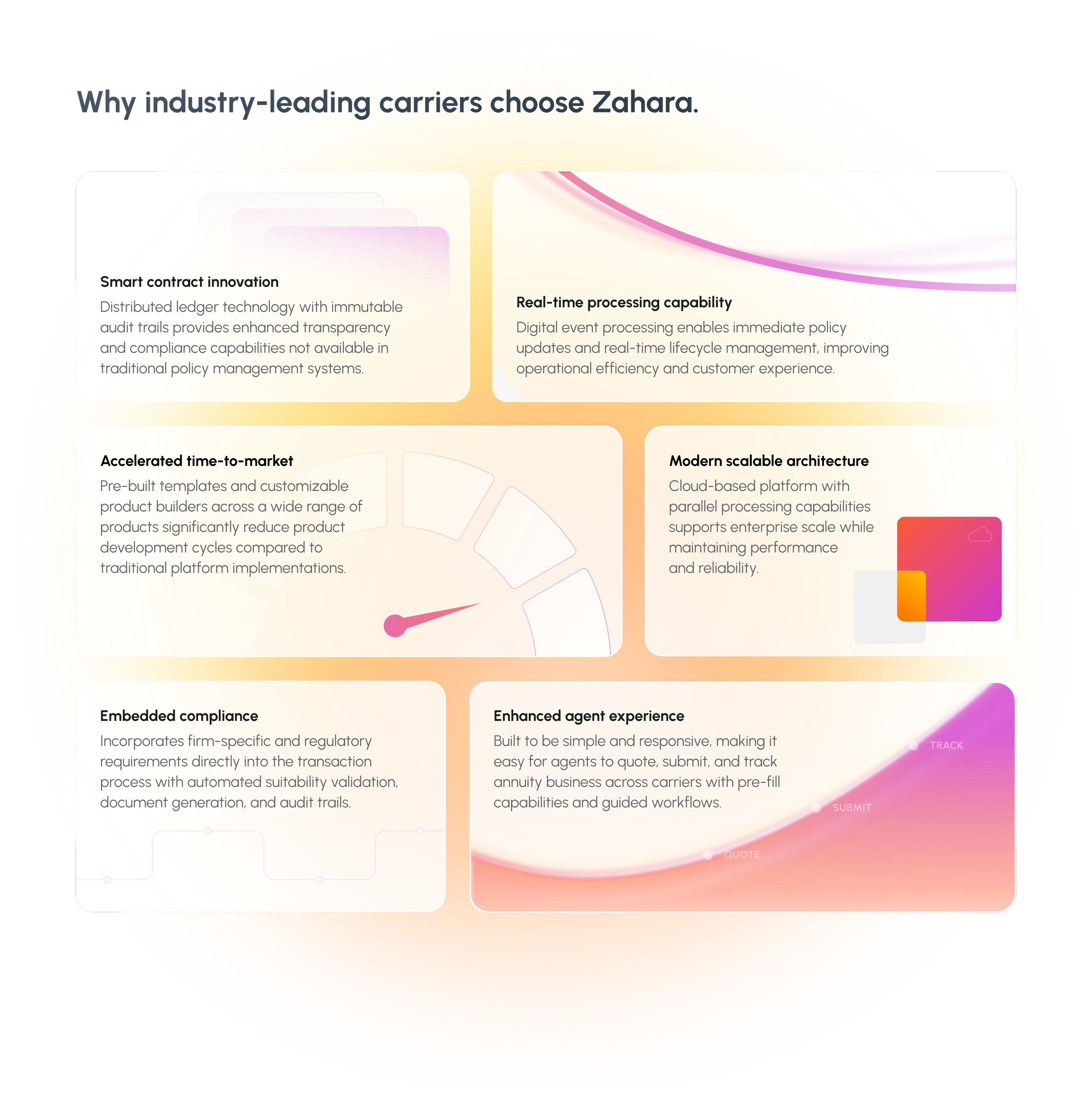
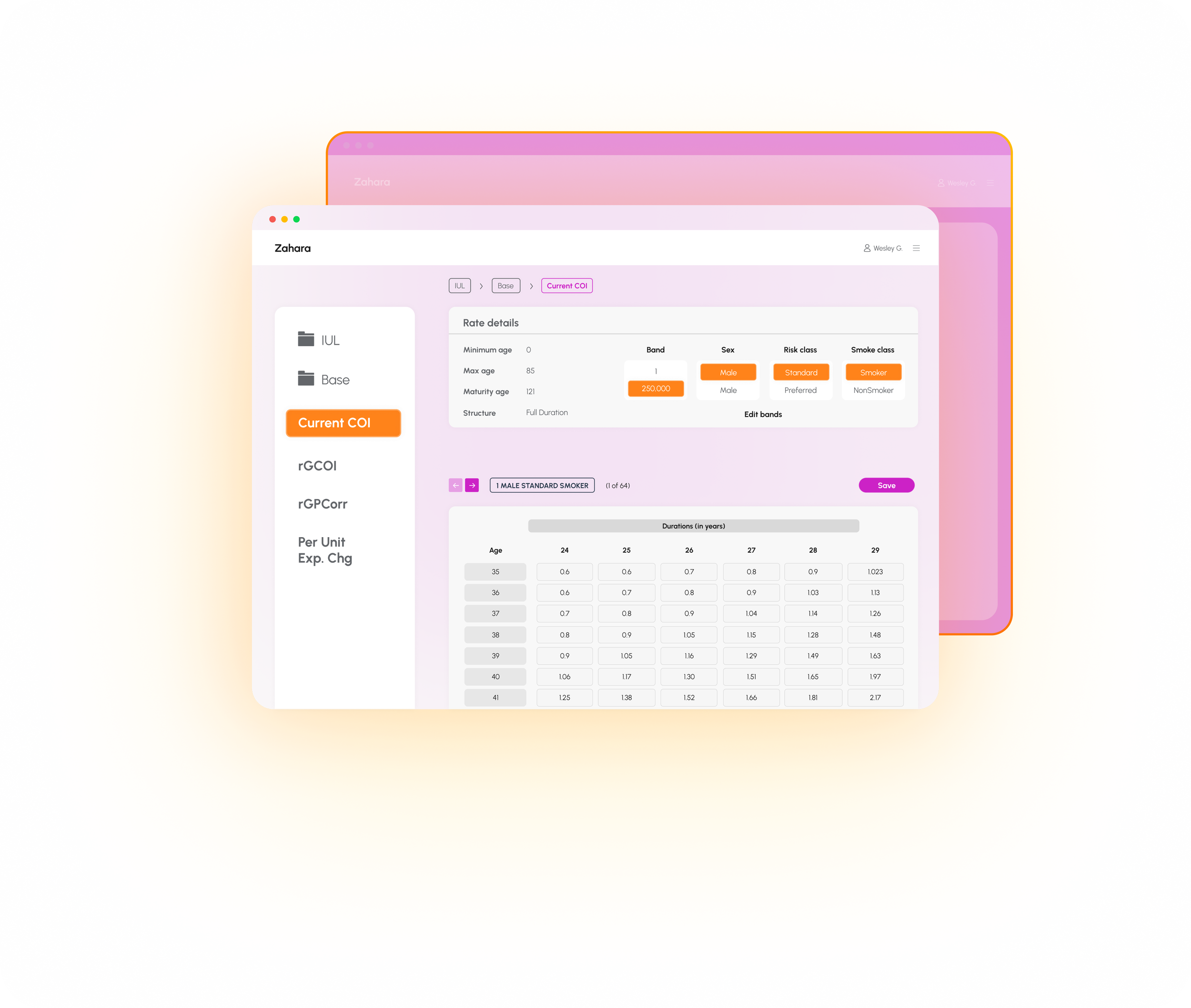
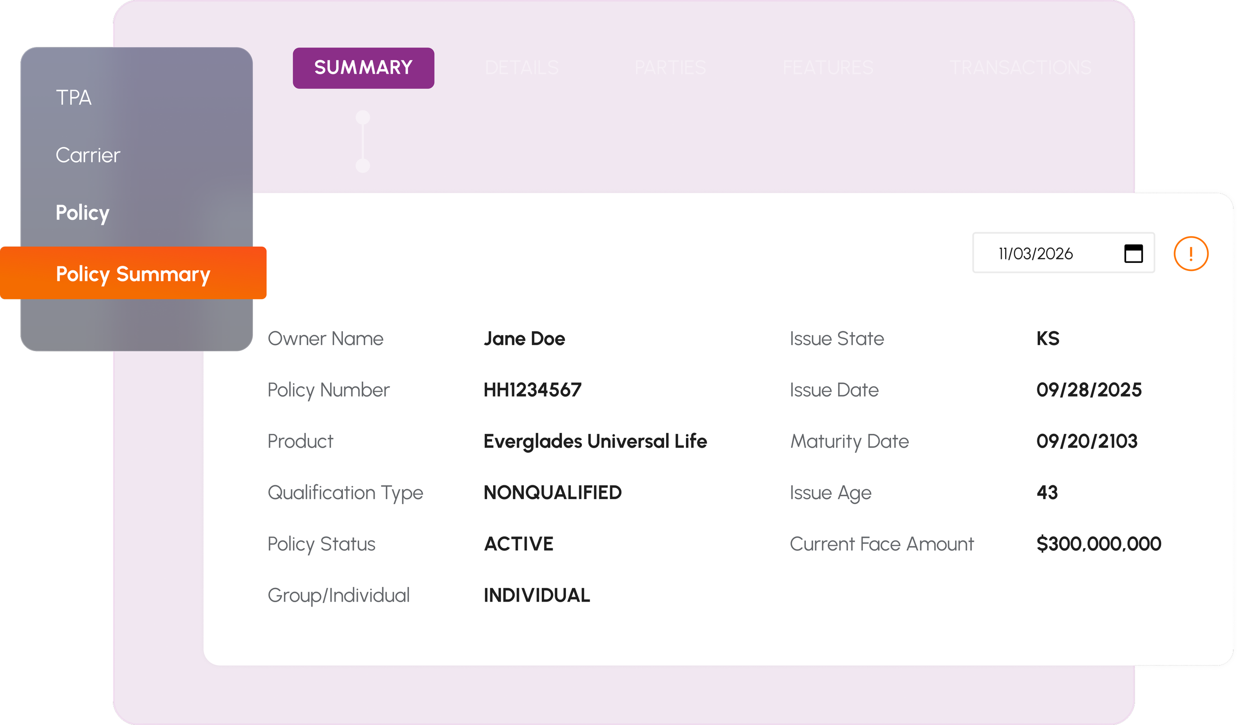
The messaging in this concept is bolder, and meant to stand out in the insurance industry, hence the name. Our website graphics bring the Zinnia brand to life across digital experiences. From gradients and glow elements to UI visuals, these assets add depth, energy, and clarity to the interface.
Use these graphics to support content, not compete with it. They should enhance hierarchy, guide attention, and create a cohesive visual system across the site.
Our website color system extends the Zinnia brand palette for digital use, including UI elements, data visualization, and graphics. Colors are organized into two groups to balance accessibility and visual expression.
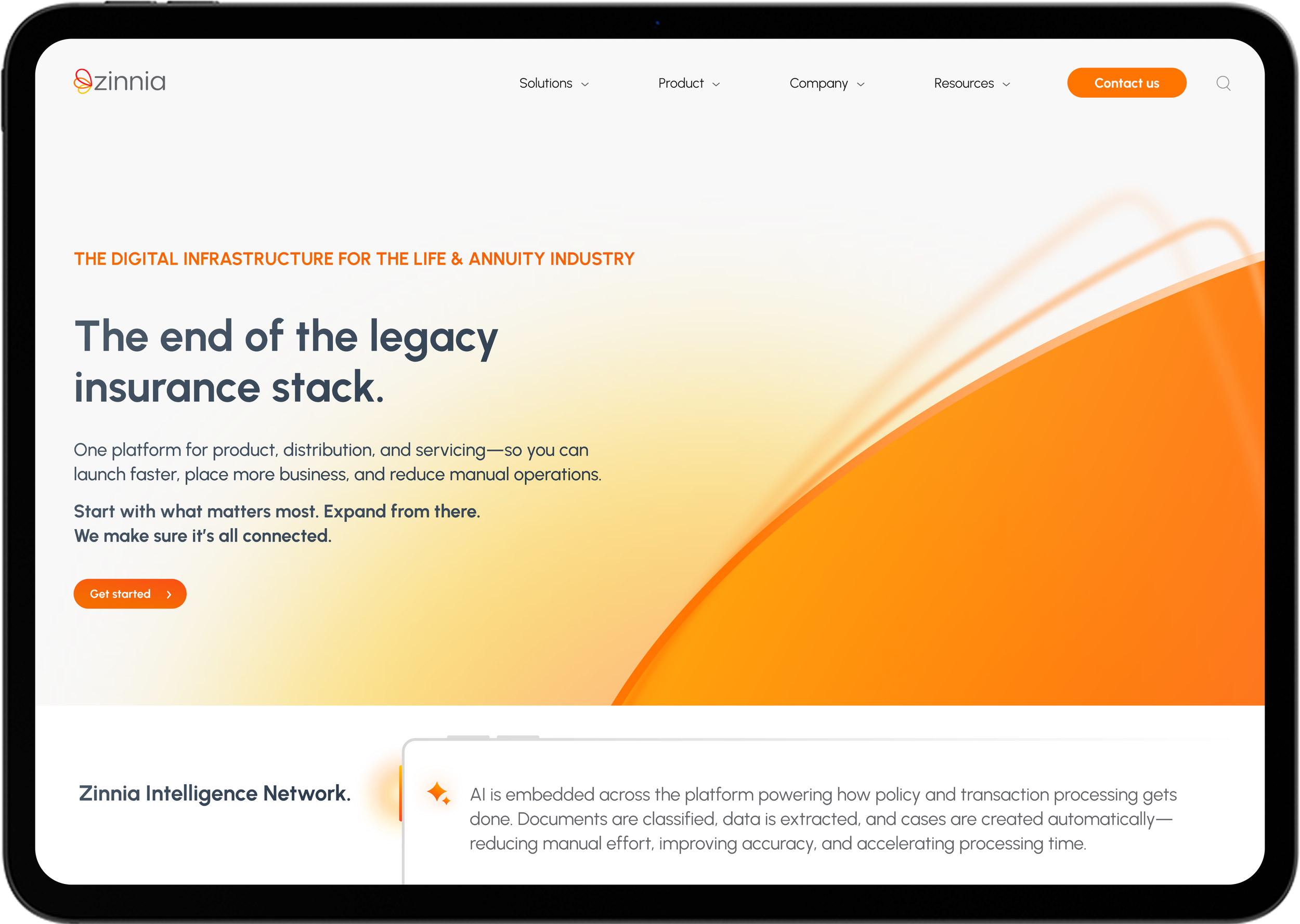






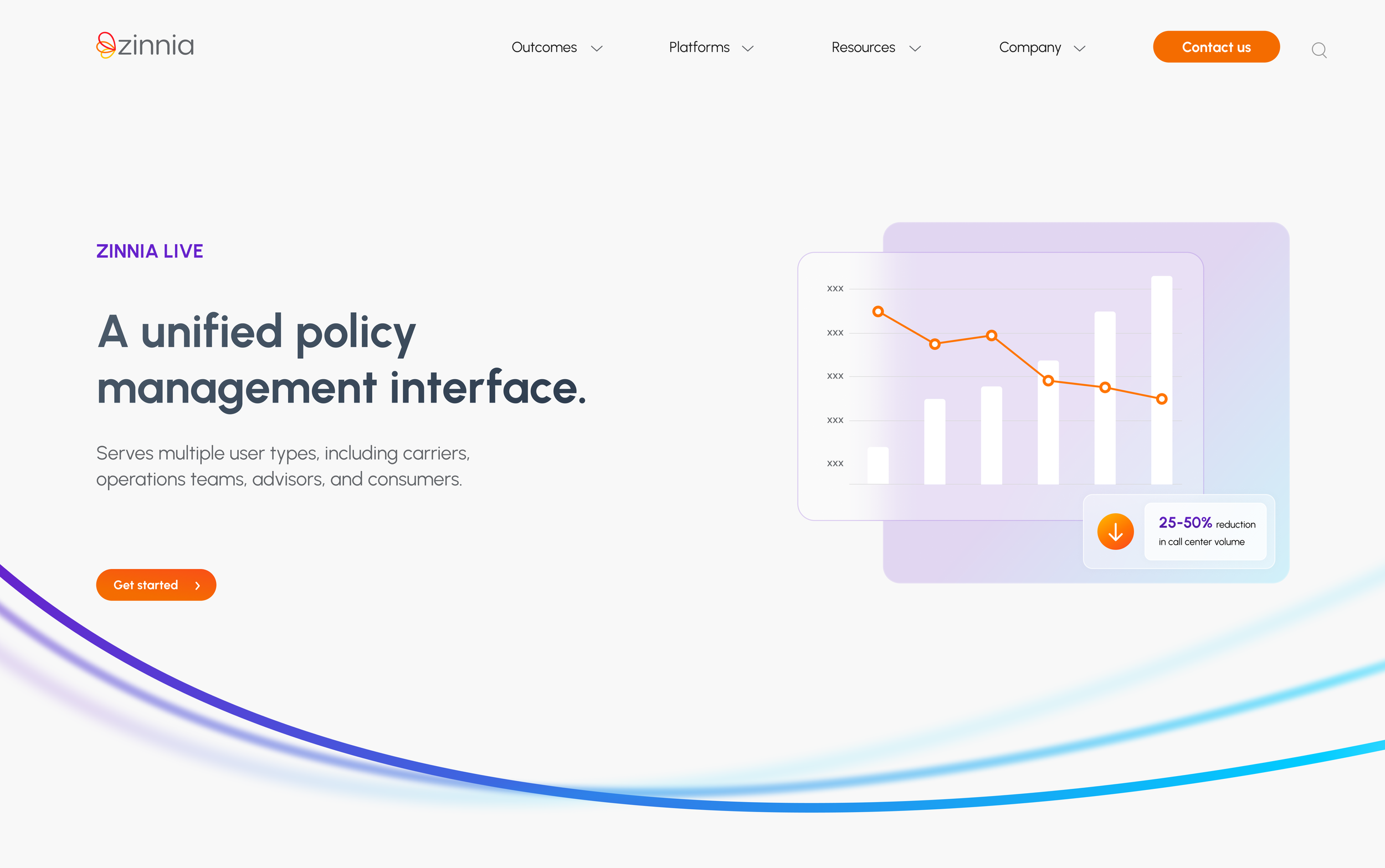
Zinnia Live Webpage
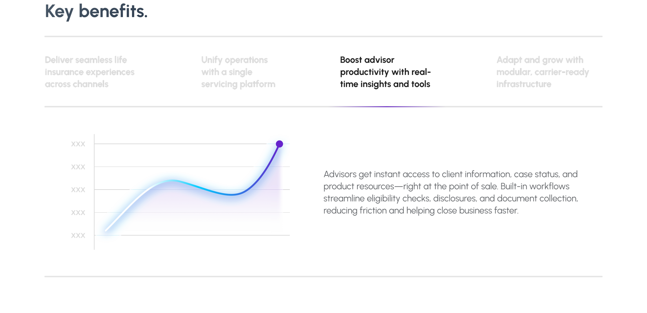
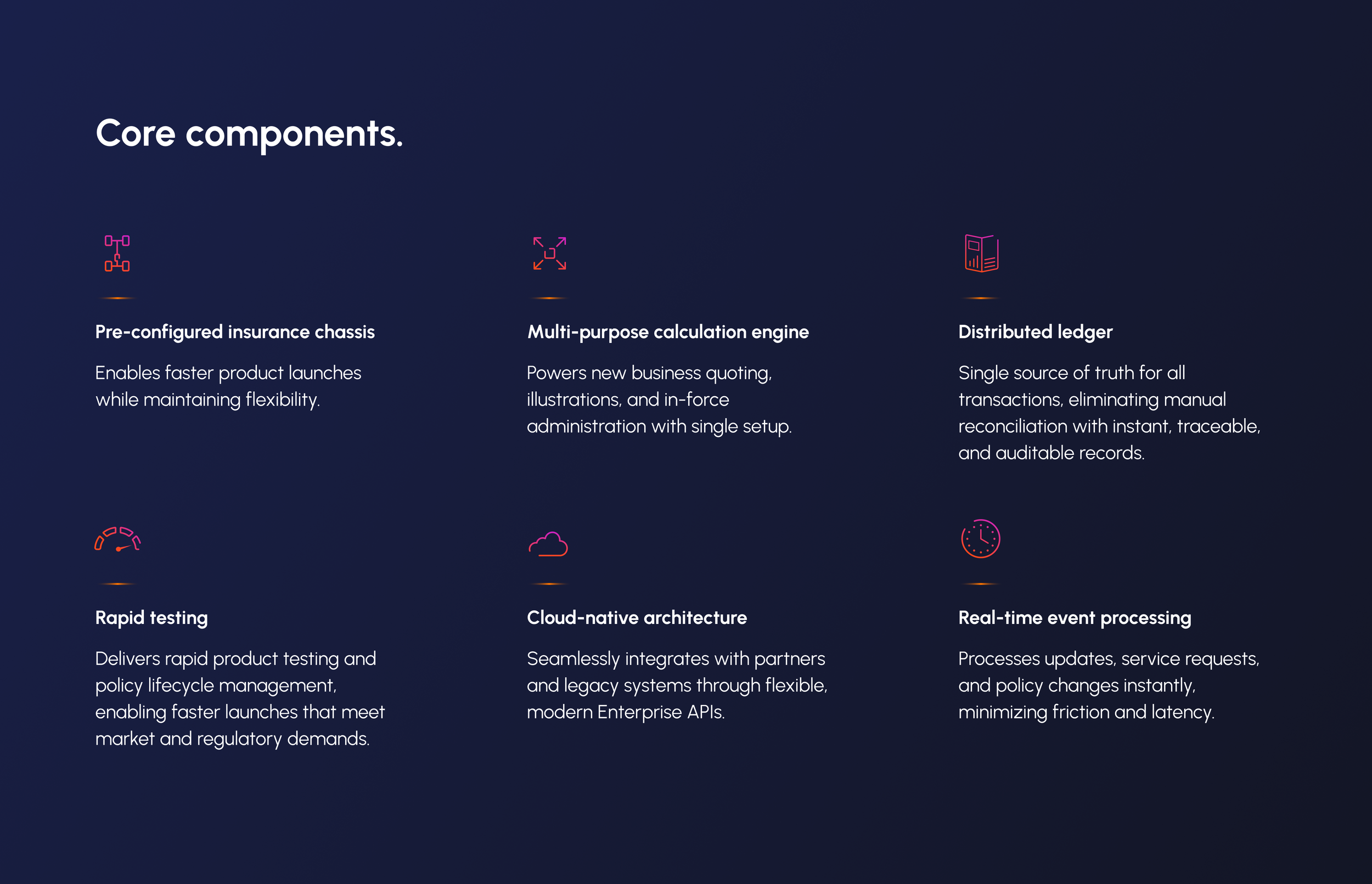
Zahara Webpage
Better together
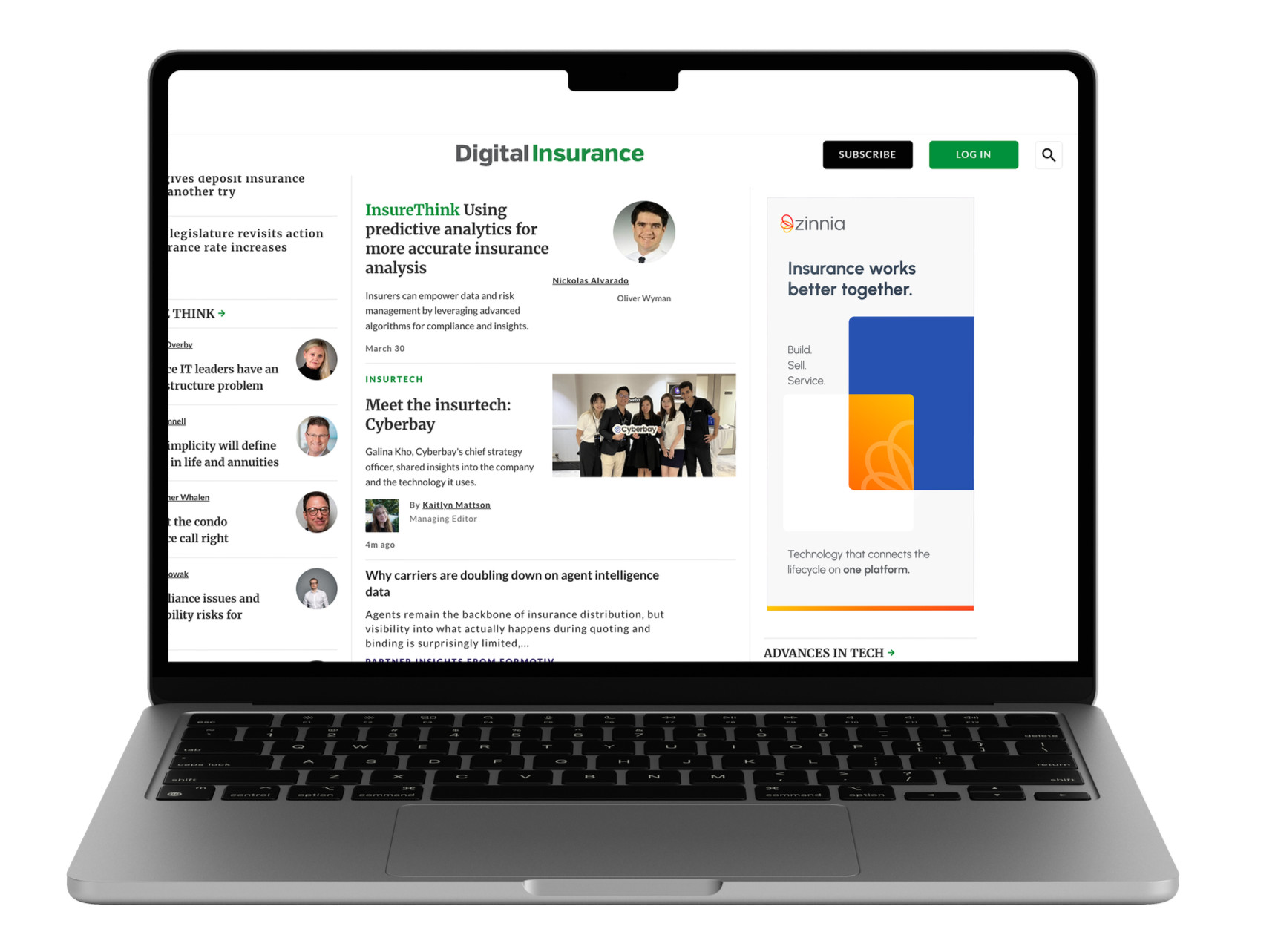
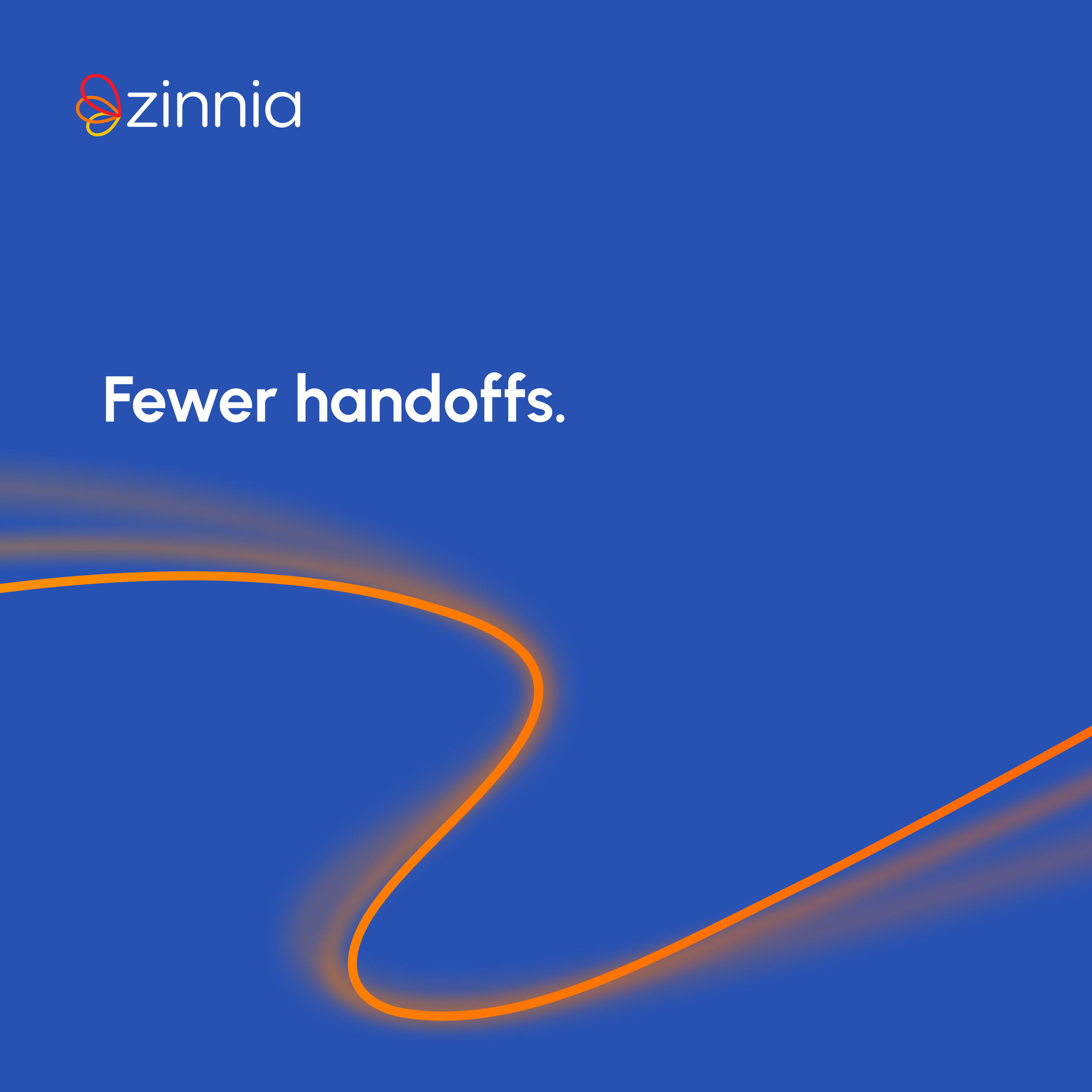
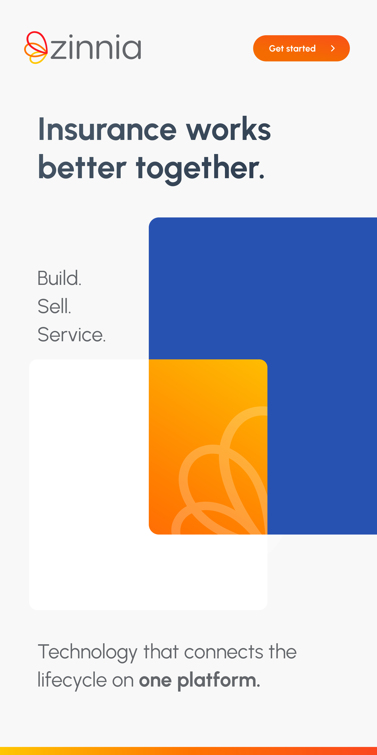
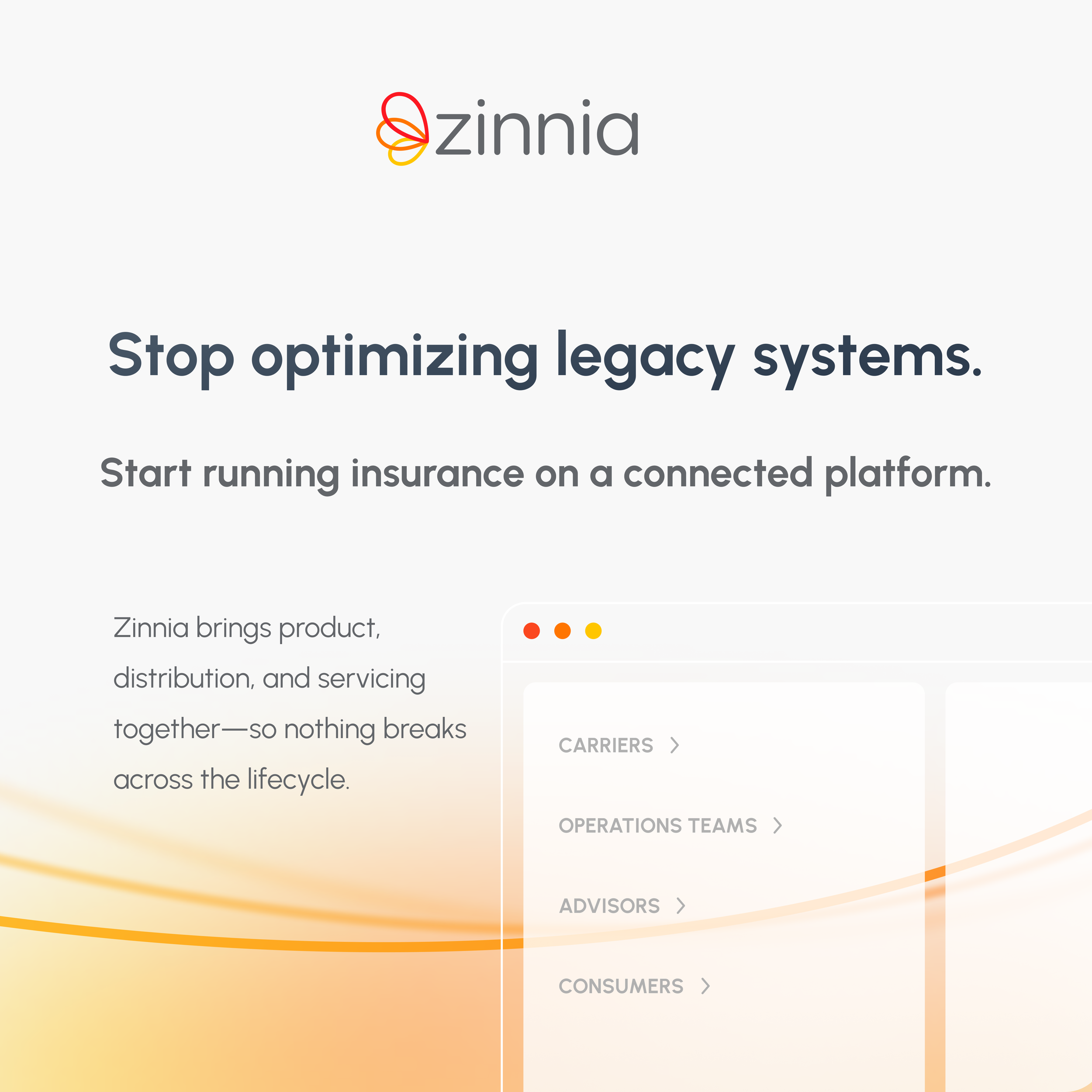
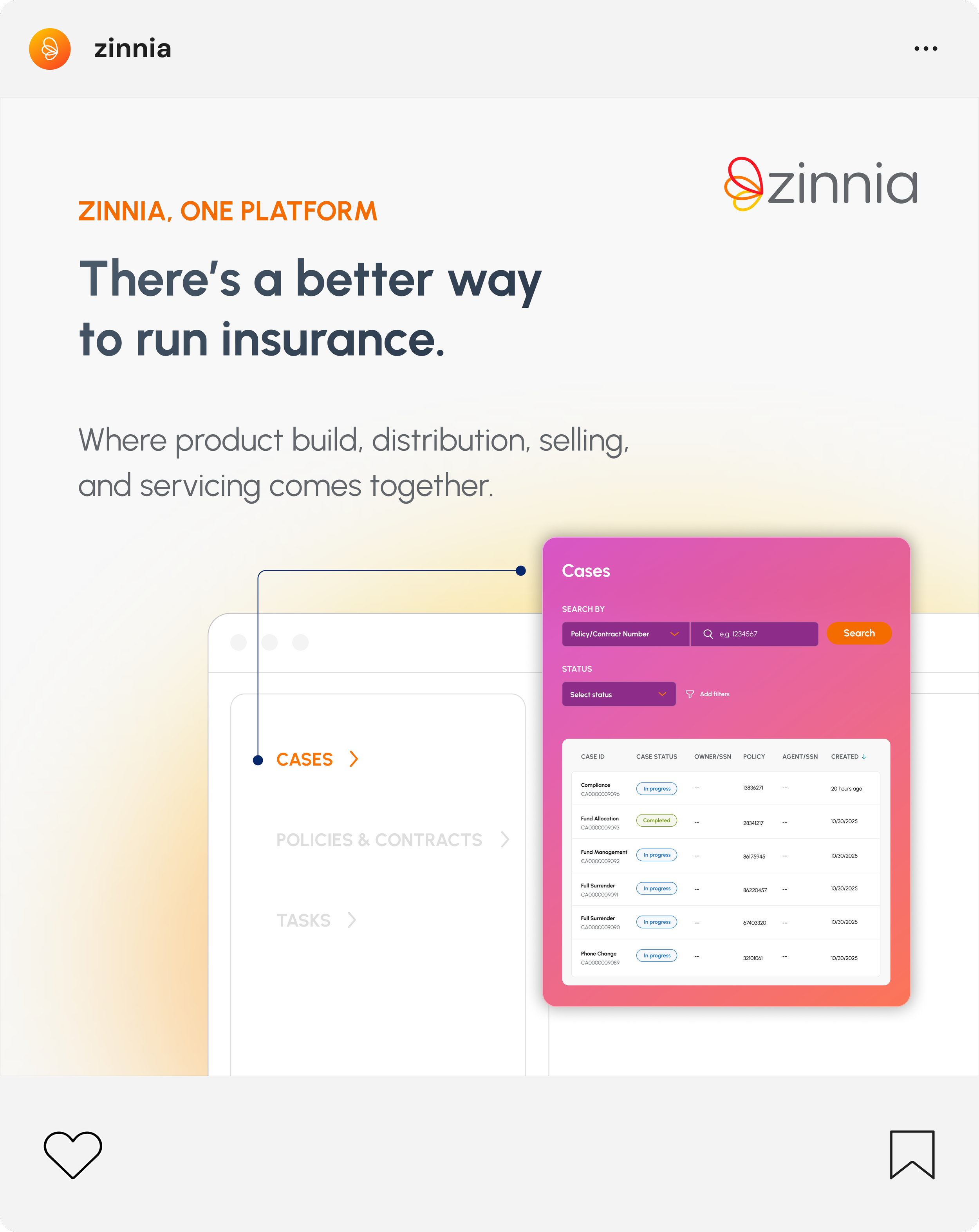
This direction leans into a more collaborative, human feel — really bringing that idea to life that insurance works better when everything works together. We’re introducing blue as a core color to bring in a sense of trust and stability, while still using orange for energy and emphasis. And then these new flowing line graphics help visualize connection and movement across the lifecycle, paired with UI moments that bring in our featured tech.